Topps publishes eight different card collection apps on iOS and Android, all of which I have contributed towards. These apps include supplementary quests and gameplay. As a User Interface Designer I contributed towards the design and development of screens and components within the apps. Just a few of the components I worked on include:
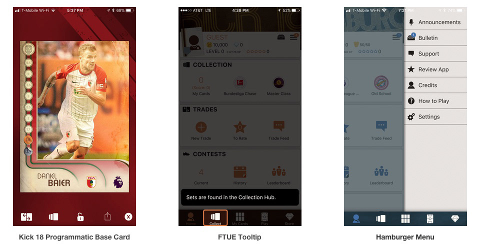
FTUE Tooltips – Scrims the screen and guides a new user through a tutorial on important game features while providing tips.
2018 Base Card Templates for Kick, Huddle, and Skate – An in-game art “template” that sets the style for the years cards. Designers can then fill in information about the specific card and have it auto generate.
Interface coloring based on favorite team – After the user picks a favorite team, the UI colors will change across the entire app to match that team’s colors.
Updated hamburger menu – Along with aesthetic changes, I updated the existing hamburger menu in the app which was previously an overlay, to push out from the side of the screen instead. The user can drag to slide it in and out with gestures.
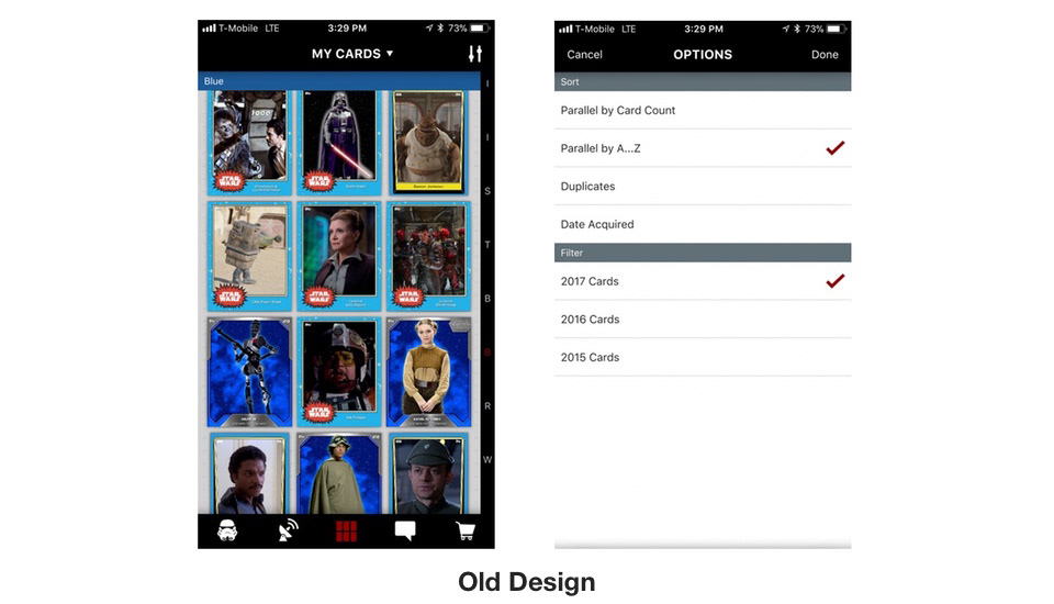
“My Cards” Filtering Design Update
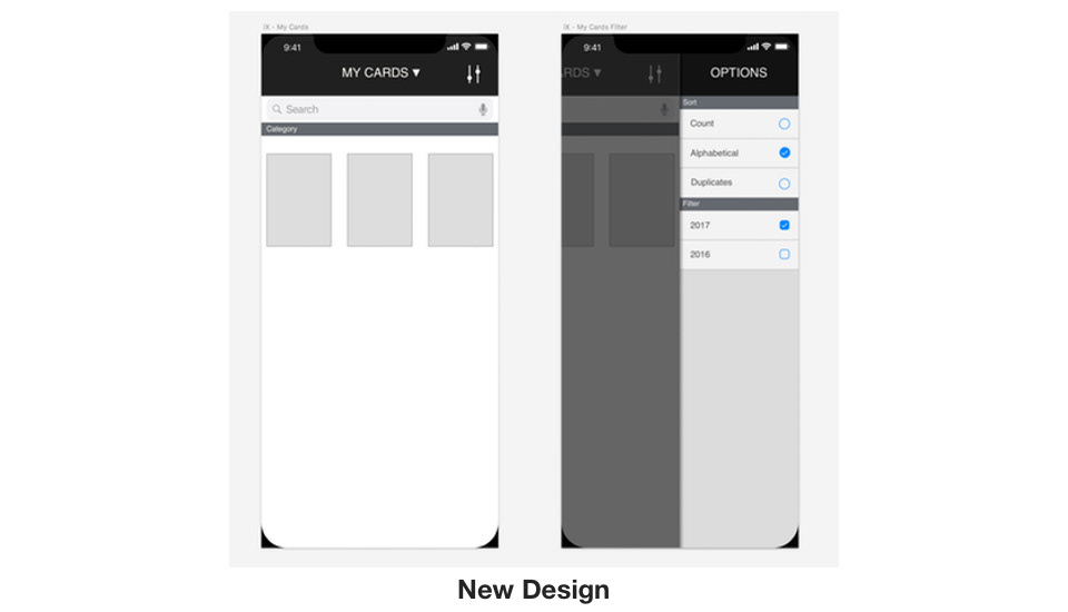
The image above shows my wire framing for a redesign of the “My Cards” screen card filtering flow. Below you can see what the screens looked like previously in app. In the past, filtering your cards would bring up an options panel that filled the entire device’s screen. As you can see though, none of the options are long enough to go past the half way point. This leaves a lot of blank space on the right.
My proposal started with making better use of this space. In my design, the options panel slides out from the right side of the screen, and only takes up half of it. The other half is the My Cards screen that got pushed over, and is now scrimmed. This transition is less intrusive, and having the My Cards screen still somewhat visible gives context to the options you are choosing. As you select options, the card collection will refresh to show that your changes are taking effect.
This design also brings the menu into design parity with my updated hamburger menu on the Home screen. Similarly to that screen, you have multiple options for opening and closing the panel. You can tap the icon to open, and tap the scrim to close. Or you can swipe left from the right edge of the screen to open, and swipe right to close, based on user preference.
Another improvement with my iteration on this interface is that the previous interface only indicated selected items with a check mark. However, some categories allow only one item to be selected, whereas others allow from zero to all of the items to be selected. The user previously had no way of knowing this without trial and error. My design adds checkboxes and radio buttons as a standard way of conveying this information to the user.